By now, most of you are up to date with all the numbers and figures of the Covid-19 cases worldwide, but, have you seen the mathematical side of things? You’ve probably heard of the terms “exponential growth” and “flattening the curve” but what exactly do they mean and what’s this SIR model anyway? Most importantly, what can it teach us about Covid-19?
Disclaimer: I am not expert at this topic and everything in this blog is just my research work to get a better intuition of the mathematical models and of Covid-19. Credit to this research work goes to the citations in the footnotes.
Definitions
Firstly, we gotta understand what these terms mean…
- Exponential growth – as you go from one day to another, the number of cases of the disease gets multiplied by a factor. The number of cases tomorrow would be a constant multiplied by the number of cases today.
Let’s say that the number of people already infected with the virus are exposed to x people. And, the probability of each exposure becoming an infected individual is y. The constant would be xy(x multiplied by y).
In reality, exponential graphs are not exponential forever, they do have a point where they start to plateau. So we can refer to them as logistic graphs. Now, in our case, we know that at some point, the “curve will flatten” however we don’t know when! This is where the maths comes in…
- SIR Model – Using mathematical models known as SIR models, we can test out various factors and see how each factor plays out in controlling this outbreak. Ok, I get that but what exactly does SIR mean?
SIR models break down the population into 3 categories:
Susceptible – number of individuals who can get the disease
Infected – number of people who have the disease
Removed – number of people who have either recovered from the disease or died
Here’s an example…

On the y axis(vertical) we have the population and on the x axis(horizontal) we have time. Over time we can see that with this particular disease, the number of infected individuals(red line) peaks to 250 and then the curve goes down with time.
The number of removed cases(yellow line) increases exponentially in the initial stage perhaps because of deaths from lack of medication. Then over time, it flattens and majority of the people have probably recovered from the disease due to the availability of medication. This graph is a perfect example of a logistic graph.
Lastly, the number of susceptible cases(blue line) is high initially because everyone is likely to get the disease; as medication and better treatment is introduced, over time, the number of susceptible cases decreases.
There’s your intro. Now let’s get to the exciting stuff!
Detailed Models
To see what factors have an impact we can try them out one by one and see how the models look. The four most important cases that we need to consider are:
- Free for all – this is when everyone continues to live like “normal” and there are no government restrictions in place. This is just to give a ground zero for comparison with the other 3 cases.

Remembering the basics of how SIR models work, this is clearly not good as almost the entire population gets infected(orange) at its peak. The idea of pulling this peak down is to reduce the strain on the health services so that they can prepare and provide enough medical support to everyone infected. If we can stretch the orange curve on the horizontal scale, it would give the health services time to prepare which would therefore lead to more cases being dealt concurrently.
- Attempted Quarantine – this is when people who are infected self-isolate and quarantine however there isn’t heavy testing in place so not everyone affected may be quarantined. This according to Lawrence O. Gostin, a professor of global health law at Georgetown University, is not so effective. He said “The truth is those kinds of lockdowns are very rare and never effective.” The flaw with this is that the people who are infected and haven’t quarantined are likely to spread the disease so, ultimately, more individuals within that community would be infected.

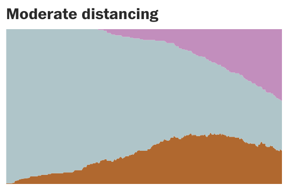
- Moderate social distancing – what happens when a quarter of the population continues to go around the city and the rest of the population is “social distancing”? Clearly, there are better results as there would be fewer interaction with others therefore less chances of the disease spreading. However, we can still see quite a large portion of the population being affected…
- Extensive Social Distancing – Now, what if the entire population is social distancing so that the chances of gatherings is kept at a minimum? Of course there’s excellent chance of containing the disease and eventually even eradicating it.
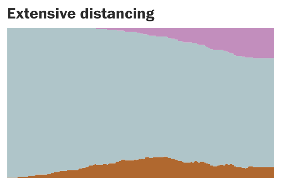
From this we can see how effective the implementation of social distancing can be relative to the others.
Now that we have the basics, here are some more models that explain the factors affecting the growth factor:
- A normal day with daily interactions and no restrictions.
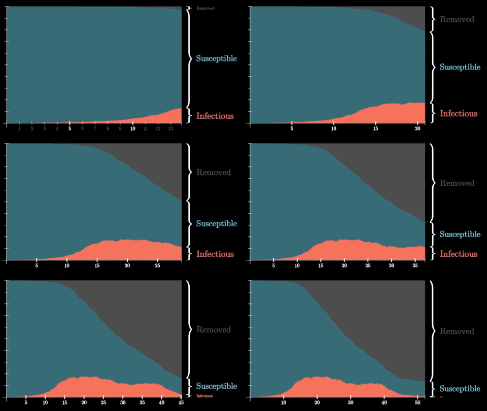
- Doubling the infection radius. This can be due to a more socially engaged society where there are more interactions with other people.
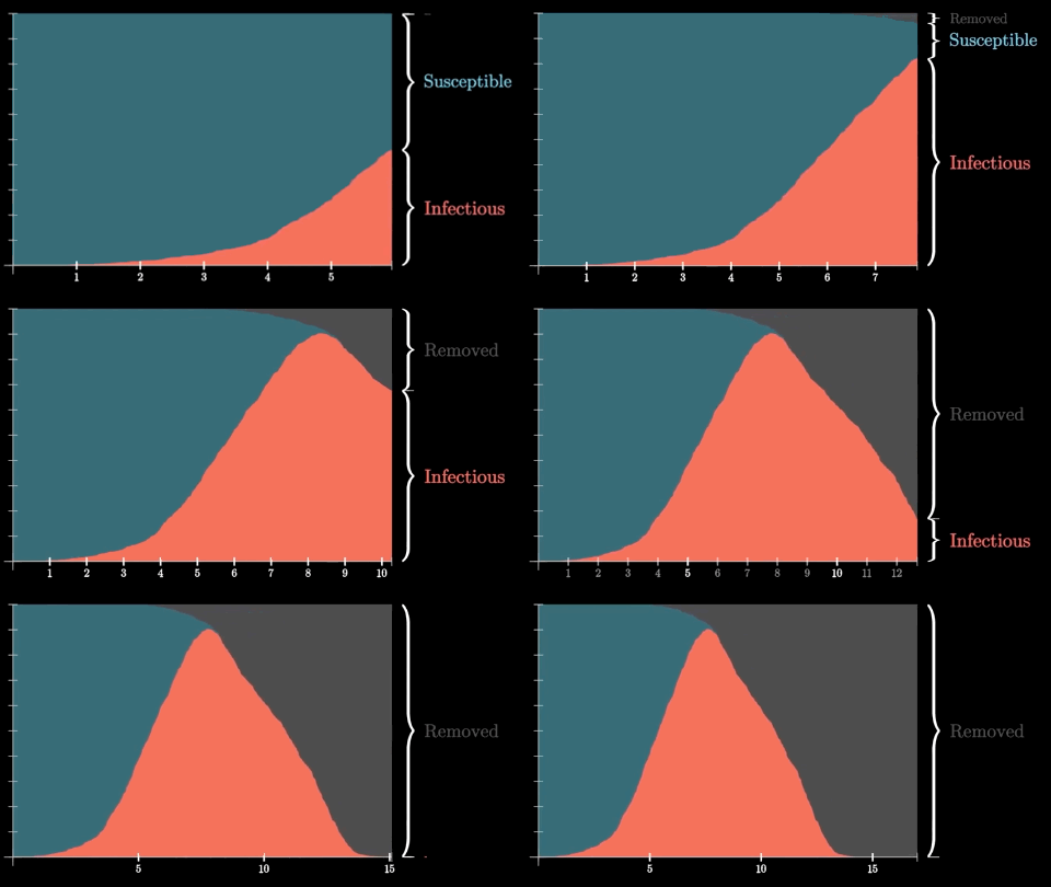
- Halving the probability of spread. This can be better hygiene practises including hand-washing, avoiding face, avoiding contact etc.
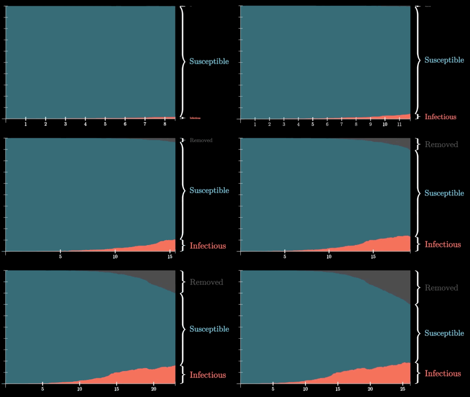
An Effective System
What’s most effective is to “identify and isolate” whoever is affected. So, if we quarantined all the people who had the disease into a separate location within one day of them getting the disease, we can see that the number of cases quickly goes down and no new cases are formed. This is because we’ve isolated the affected individuals. In reality, this would require accurate and responsive testing tools to “identify” the individuals within 1 day which is quite tough during the initial phase.
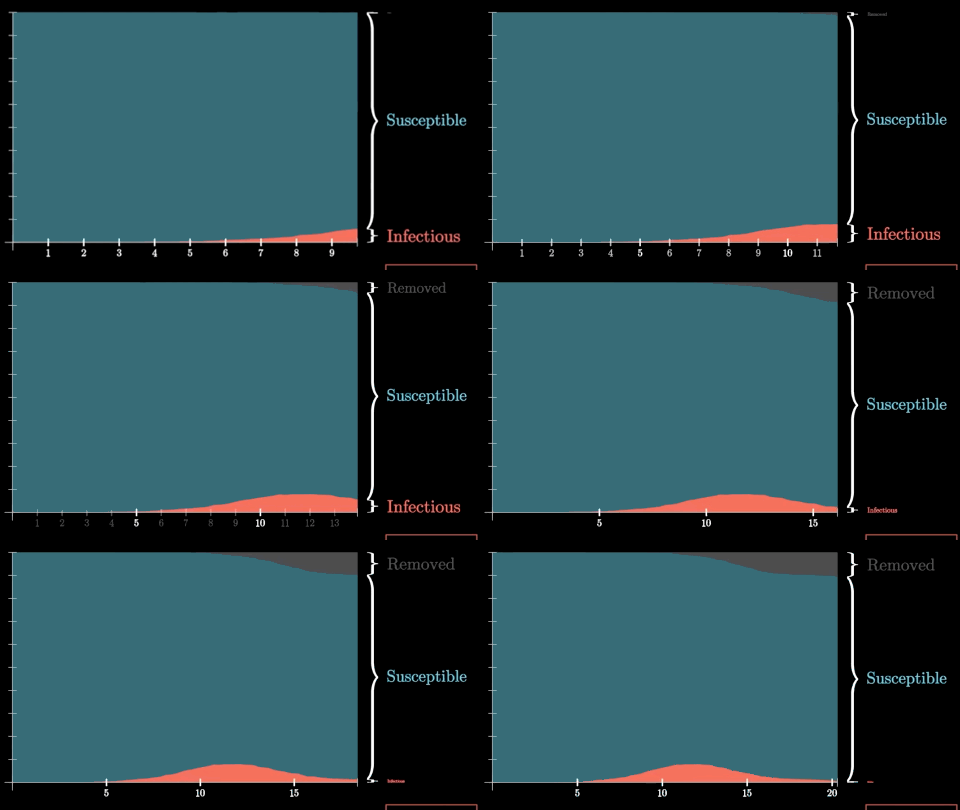
Not 100% of people would know that they have the disease immediately after getting it. There’s a period of time where they show no symptoms. So, say we only quarantine 80% of the population(slightly more realistic), there are far fewer cases than there would be without quarantine, however, there are still cases which just stretches out the time period for the disease. Due to the stretch in the time, it would eventually result in about twice the total cases as above.

Key Takeaways
Form all of these models, there are various things that we can learn:
- Social distancing clearly has an effect(when 100% of the population does it) in eventually eradicating the disease, however, it can prolong the duration of the disease if there’s just a small portion of the population not participating in the distancing…
- The Growth Rate is majorly affected by fewer daily interactions, lower probability of infecting someone else(better hygiene practises) and duration of illness. If we can reduce the number of daily interaction and improve our hygiene by avoiding our face and washing our hands(which you’ve probably had enough of), we can drastically reduce the growth rate of the disease.
- Testing for the disease also plays a major role. From the above section on quarantine, you probably got an insight on how the use of fast and responsive testing, can affect the disease’s rate. The fact that it has a disproportionate effect on the SIR model makes it crucial to have excellent testing facilities to quickly “identify and isolate” affected individuals.
- Travel clearly has an impact. For example, if people regularly transit to their local stores, the probability of infecting would be high so a huge number of people can get infected. However if travel is banned completely, the infection rate reduces.This doesn’t mean that banning travel can solve the problem. If the travel restrictions are introduced late, the impact of those restrictions is minimal. However, if we introduce travel restrictions early on in the game, there’s a better effect in reducing the impact from the disease.
That’s your brief overview of the SIR models and what we can learn from them. I hope you got a slightly better understanding of the reasoning behind social distancing and how effective it can be in different occasions. Let’s try to practise this method as much as possible and let’s lock this virus down together!
Citations:
3Blue1Brown Video – Simulating an Epidemic
3Blue1Brown Video – Exponential Growth and Epidemics
Washington Post Blog – Corona Simulator
Melting Asphalt Blog – Outbreak
I would like to thank the above links for the animations, images, and the content used in this blog.


Leave a Reply