Got an Android? You’re gonna like this! Do you feel like you are spending too much time on your phone? Want to find a better balance with technology? Don’t worry… Google’s got you covered. Google announced its new Digital Wellbeing Experiment Collection with a few apps that help you focus on what you need so that you have a healthy connection with your phone.
What is it?
The collection contains 5 apps which can assist you with your digital wellbeing. Everyone’s phone usage and styles are different so each app has a unique approach.

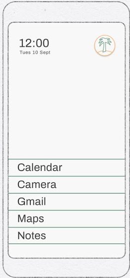
Desert Island
This app uses a minimalist approach to simplify your home page to just 7 apps. There’s a small icon in the corner to tuck away all the other apps. I particularly admire the minimalist design of the app which works fantastically. It gets rid of all the app icons to an alphabetical list of your apps. If you can restrict your home page list, this app will work incredibly.
Morph
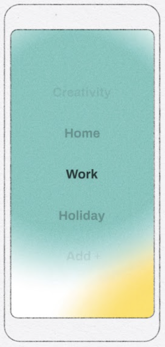
As the name suggests, the app uses a colourful design to transition through a list of categories for your apps. You can create your categories and look for exactly what you need. Essentially it uses the folder concept with a vamped up design. The design looks neat however, you may still be tempted to access the “social media” or “games” categories.
Unlock Clock
Get ready for embarrassment because this app shows the number of times you unlock your phone each day. This may not be you however, the app aims to reduce your phone unlock times by showing how much you unlock it! This, in turn, would reduce your phone usage for a healthy experience.
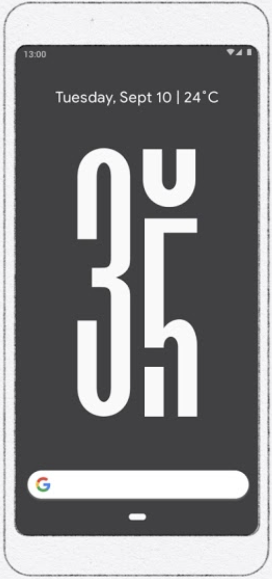
Clearly, you may already see the flaw in this… It’s not restricting your time. You can still make up excuses for why you are unlocking your phone extensively.
We Flip
This app is particularly aimed at groups as it’s a more collaborative effort. It uses Nearby to connect everyone and then each person has to flip the switch to start group time. During this time, the aim is that nobody gets distracted by their phone. If someone in the group unlocks it, the session is automatically ended and stats are reported at the end.
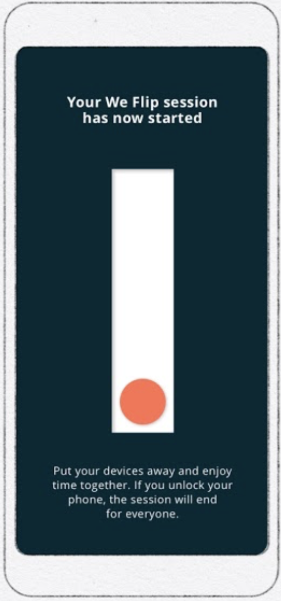
The idea is very ambitious however, it requires everyone in the group to have the app. When it works though, it can bring some quality conversations!
Post Box
Lastly, Post Box is a notification delivery system. It allows you to choose when and how frequently you want your notifications. Based on that, it organises the notifications into different categories using the bin packing design. This saves you from being distracted by those social media notifications and helps you work through all of the important emails and messages at once.

I tried all the apps on the first day however, Desert Island instantly worked for me.
My Results
I planned a 2-week project where I used my phone without Desert Island for the first week and then used Desert Island for the second week. I collected my phone usage times for both the weeks and here’s a graph of my results:
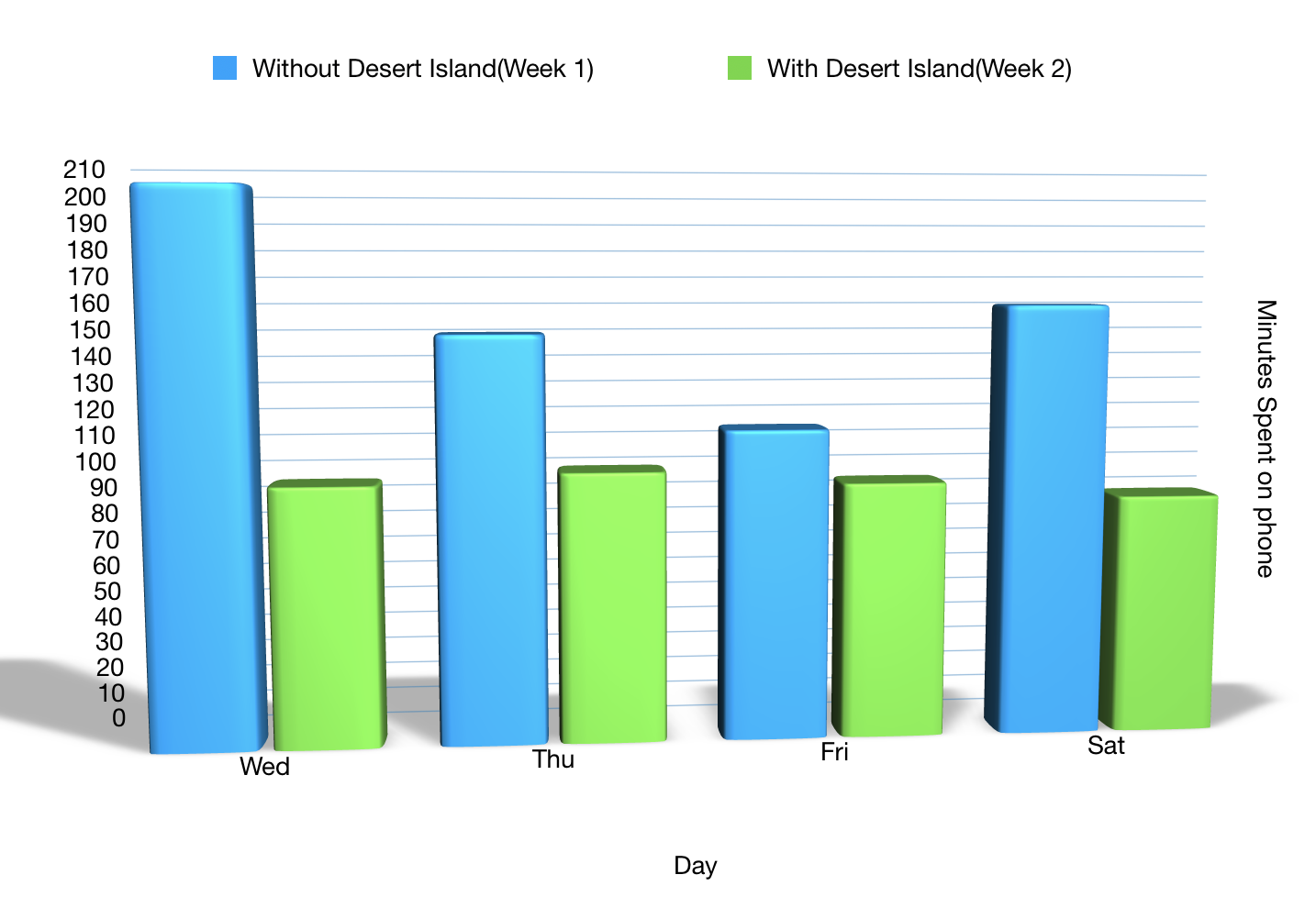
And hey, it worked! My phone usage decreased quite a lot especially on the first day where I used my phone for less than half of the time I did the week before!
What next?
Now that I have an idea of the impact the app can have on me, I am going to continue using it to simplify my experience with my phone. I believe this collection can transform many people’s experience with technology for a more connected future.
If you are interested in finding out more information, please visit Google’s page on Digital Wellbeing Experiments.

Leave a Reply